[x]

*Murasaki-Hoshi - Artist Pages

Featured in:

Not currently featured in any groups.

Share

Link
Embed
Thumb

Details

November 21, 2009
1.1 MB
132 KB
600×849

Statistics

73
2,089 [who?]
17,917 (2 today)
0 (0 today)
:iconmurasaki-hoshi:
a commission for :iconmariust2007:

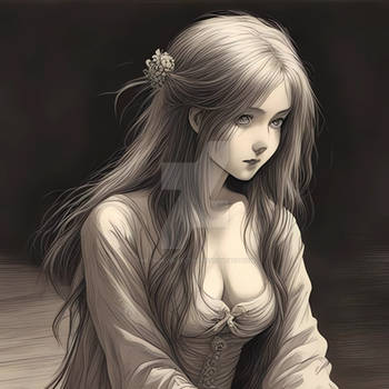
this is her OC named lilith, painted her in steam punk version


hope you like it ^^


for more information about this character , please visit :iconmariust2007:

:iconichigokonkon:
I think the colours that are created in this piece, along with the smoothness of the outline and the background, create something that's truly very beautiful.
Though I think this is a great picture, there are some things that I notice that are worth mentioning.
Some of the proportions are a bit off. With the realism of the folds in the clothing and the gears, the proportions that are not as realistic stick out a lot.
The only things that I really notice, though I wouldn't necessarily call it "bothersome", are the proportions of her face, shoulders, and chest. Her head is oddly shaped and a little too small. The way it is tilted makes it look like there is absolutely no neck, which makes her shoulders seem far too big with her head in comparison. In addition to this sizing, her breasts seem far too big in comparison to her head. If you altered the shape of her head, etc., then the breasts, though large, wouldn't seem to out of place.
Otherwise, the colours are amazing, and the way you did the background, and her clothing, is superb.
Keep up the good work. c:
The Artist thought this was FAIR
17 out of 19 deviants thought this was fair.

:iconqinni:
This is a nicely coloured picture. the red eyes are standing out nicely against the whole tone of the picture. lighting is just a tad bit wonky though, since so much of the light is coming from the back, her chest and most of her face shouldn't be lighting up like that technically.
Just a few anatomic problems i'd like to point out: the connection of her right forearm and wrist is not done correctly. the hand should be in front of the forearm, especially because you can see so much of the back of the hand. the upper part of that arm is also a little too bent, making it look like her bone is bending. the hand is also a bit wonky, looks very lanky compared to the rest of her body. the angles of her bones are poking out too much in her hand.
these are the major problems that jumps at me. other are very minuscule.

overall, it's pretty well done. congrats =3
The Artist thought this was FAIR
119 out of 122 deviants thought this was fair.

The Artist has requested Critique on this Artwork

Please sign up or login to post a critique.

love 8 8 joy 2 2 wow 4 4 mad 0 0 sad 0 0 fear 0 0 neutral 0 0
:iconbirdie121:
oooh! great detail!

--
Everone has a talent. But no one starts off good at anything.
- - -
Please check out my profile and gallery! ~Birdie121
:iconwings-of-art:
she looks good.
nice light effects :sun:
:iconmitsukimaru:
awesome^^

--
shira Uchiha
:iconedwinshy:
Dark ,mysterous , & beautiful that`s what I like in a girl :)

--
Edwin`s the name , drawing is my game
:iconpink-leopard:
Very beautiful work!!! Its so pretty!!!

--
xXx~Little White Dove~xXx
:iconcronic25:
nice eyes
:iconakua:
Very nice. The hands look a little off, but otherwise it looks great. Nice coloring :)

--
Open for Commissions.
$5US Sketch Sale (ends 7/31)
------
Love Me, Hate the Game
:iconsimpleanimefan:
Sexy yet cute, brilliantly done ;)

--
.... with sauce?

I approve of messages that approve of deviations.... and llamas.
:iconterrorofdeath333:
Very impressive! I definitely like this one =) Ill keep an eye out for more works of yours.
:iconirongnome:
I don't have enough knowlege for doing a fair and good critism (or the good enough english^^) but i have to say, i really have to fave it, and i'm not having many favourits =) It's kind of sad it's juts an oc, not the biblical figure, but still great work